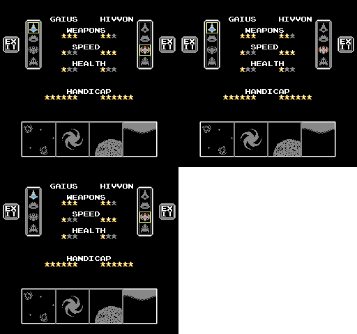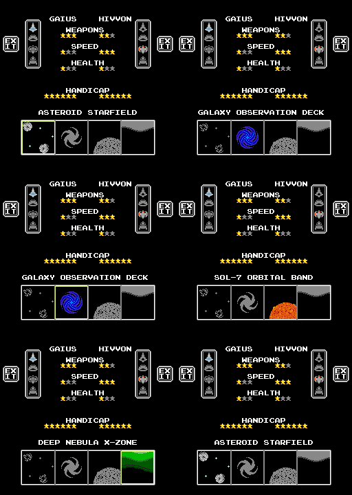
In Star Versus’s two player mode, the first thing players see is a menu to select their ships, handicaps, and arenas. Although straight forward in concept, this menu actually maxes out the NES’s graphics in multiple ways. Specifically, it uses each available palette, requires all 64 sprites, and places 8 sprites onto the same scanline. Only by using a couple of clever tricks can it be rendered at all.
Recall from the articles on NES graphics (part 1, part 2, part 3) that there are four palettes for nametables and four for sprites. Each palette has three colors, plus a shared background color. Each nametable block is restricted to a single palette, and while the 64 sprites can be placed anywhere, there can only be 8 per scanline.
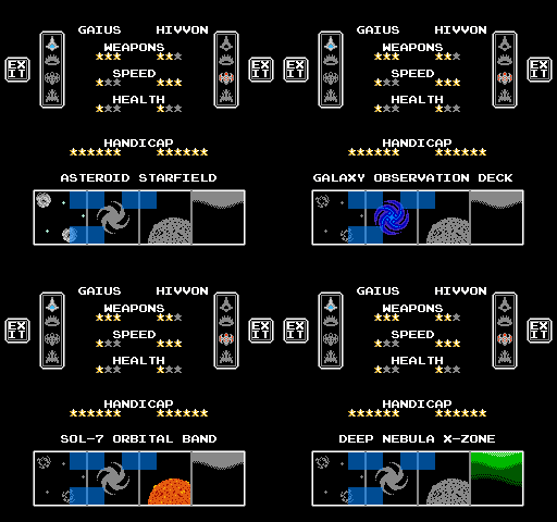
By analyzing an image of the select menu, and looking at the colors in each block we can figure out the palettes in use. Most of the background uses a single palette, containing white, medium grey, and yellow. This allows for the star meters, borders around ships and arenas, and all of the white text, essentially covering the majority of the screen. The selectable ships use a light grey, blue, and red so their palette is different, but let’s come back to them.

The trouble starts with displaying arenas. Unselected arenas use a monocolor grey, while the selected arena uses colors that match its in-gameplay appearance. There are only 4 available background palettes, not enough to handle all possible arenas and the static white for text, so colors must be updated dynamically. When the cursor moves, it simultaneously switches the palette for the old arena to grey (by changing attribute bits), while switching away from grey for the new arena, and updating the colors in the palette to match the new selected arena’s scheme. Here is what the palettes themselves look like so far:

Something similar is done for the ship selection, making unselected ships grey, and making selected ships blue or red depending on the player. However, the ships are not grid-aligned like the arenas are, because they need extra spacing to fit all of the text.

This means the ships are made using sprites, and use sprite palettes, one for player 1, a second for player 2, and a third for disabled ships. The cursors are also made of sprites (everywhere on the menu), since it allows for easy overlapping, and use a whole palette entirely on their own. This only leaves one palette remaining.

Speaking of cursors, in the situation that both players have their cursors on the same ship, there end up 8 sprites on the same scanline. Since all of these objects are 16×16 pixels, they need 2×2 sprites to display, so 4 objects (both ships and both cursors) on the same line makes 8 sprites, the maximum the NES can handle. Luckily, the arena cursor only contains 3×3 blocks, so it only needs 6 horizontal sprites, leaving 2 to spare.
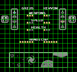
As for the last remaining palette, finding how it is used requires looking closely at the arenas. There’s a 2 pixel vertical grey border between each arena, which separates their graphics, making each feel more distinct. However, this means blocks containing these borders now have 4 colors, too many to fit into the background palettes. This can be fixed of course by using sprites to create the borders. But that doesn’t quite work, because there are 3 borders, and since the arena cursor uses 6 sprites, we’d end up with 9 sprites on a scanline.
The solution is to create the borders by using sprites in some places, and nametables in others. It just so happens that there exist 6 blocks between the 4 arenas wherein those blocks don’t use their full palette, and have a color they can spare for a grey border.

For these blocks, they use an additional palette that matches their normal palette in 2 of the colors, and keep the 3rd grey for the border.

The other grey borders are made of sprites, using up 12 sprites in total. The ships, since there are 8 of them and they need 4 each, take up 32 sprites. The arena cursor takes up 20 by itself, and miraculously these total up to 12 + 32 + 20 = 64 exactly, leaving none left over. Here’s the menu without any sprites visible:
![]()
Of course, this isn’t the only way to construct this menu. There are trade-offs involved, between the complexity of design, amount of code needed, CHR requirements, and flexibility during development. This particular implementation was developed organically, and has the nice side quality of being very efficient in its CHR usage. Most of all, it serves as a good example at some of the hidden complexity needed to make games on minimalistic systems.
Leave a Reply